

As developers, we often obsess over the tech stack—is it Next.js? Remix? How's the LCP? But a lightning-fast site that doesn't convert is just a sophisticated paperweight.
Whether you're building a SaaS product or a client site, the flow of information matters more than the hero image. Here is the 8-step framework I use to ensure every pixel serves a purpose.
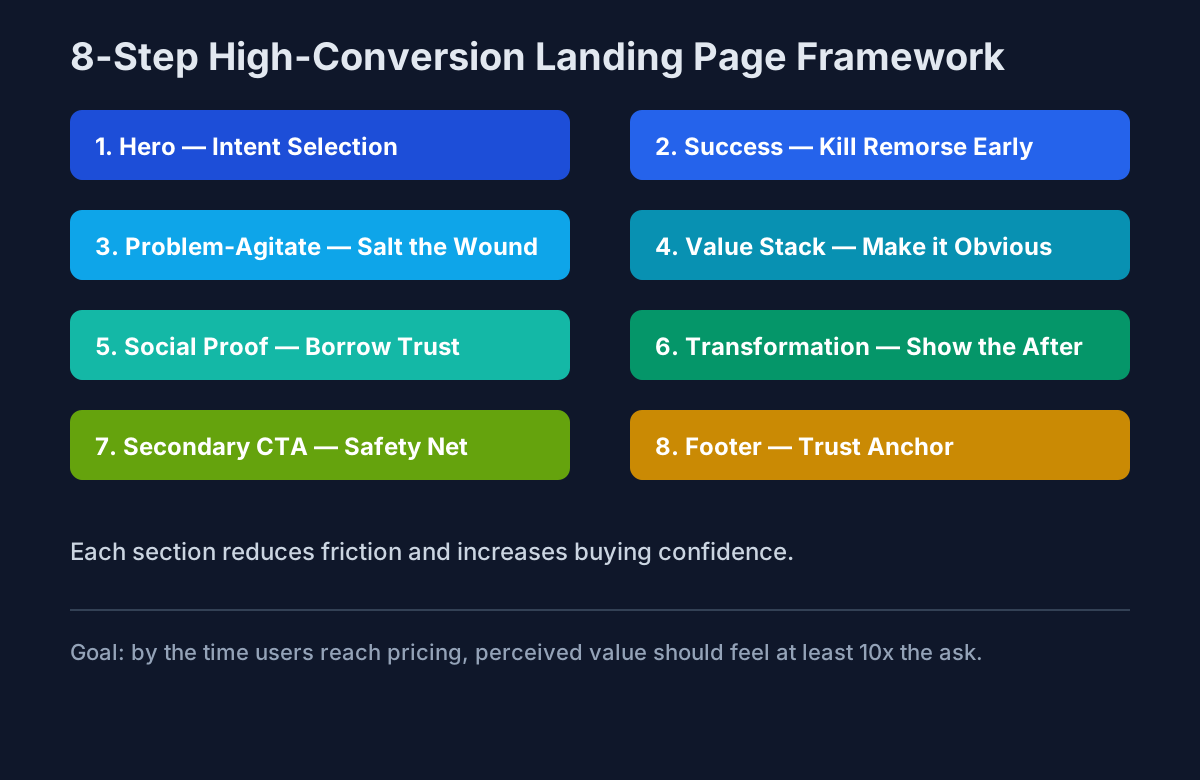 8-step high-conversion landing page framework overview
1) The Hero: The Fork in the Road#
Your hero section has one job: Intent Selection.
You either want:
- their email immediately (Lead Gen), or
- them to keep scrolling (Engagement).
Use a bold H1 that states the benefit, not the feature.
Weak: "AI-powered dashboard"
Strong: "See what your customers will churn on—before they leave"
2) Success: Kill Remorse Early#
Most pages wait until the end to show results. Try the opposite.
Put a quick win or success state right under the hero:
- a "before/after" snapshot,
- a one-line case-study metric,
- or a simple output screenshot.
This instantly validates that users are in the right place and silences the internal "is this a scam?" voice.
3) Problem-Agitate: Salt the Wound#
If users don't feel the pain of their current situation, they won't pay to fix it.
Describe the status quo so accurately they think: "This is exactly my week."
Then quantify what "doing nothing" costs:
- lost leads,
- wasted hours,
- team frustration,
- missed revenue.
The goal is not fearmongering—it's clarity.
4) Value Stack: The "Stupid to Say No" Offer#
Don't stop at feature bullets. Stack outcomes.
Feature-only messaging rarely closes. Value-stacked messaging reduces friction at pricing.
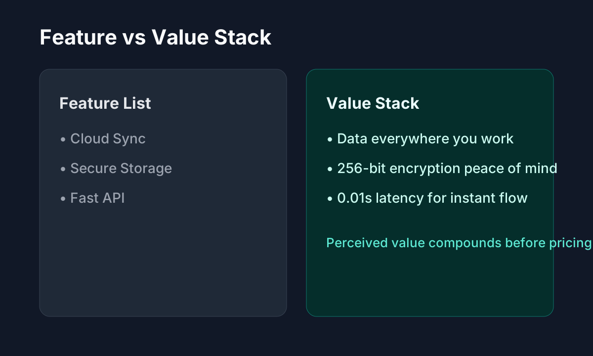 Feature list compared to value stack messaging
Example:
- Feature: "Cloud Sync"
- Value Stack: "Your data is everywhere + 256-bit encryption + 0.01s latency"
By the time visitors hit your price, perceived value should feel 10x the cost.
5) Social Proof: Let Others Do the Heavy Lifting#
Humans are social. We look for the crowd before making a decision.
Use:
- testimonials,
- client/company logos,
- usage counters ("Joined by 500+ devs"),
- short trust snippets next to CTAs.
Proof beats promises.
6) Transformation: Paint the "After" Picture#
This is your before-and-after moment.
Show users the destination clearly:
- screenshots,
- side-by-side workflows,
- case-study outcomes (e.g., "Reduced churn by 20%"),
- a "day in the life" improvement.
If they can picture life after your product, buying feels safer.
7) Secondary CTA: The Safety Net#
Not everyone is ready to buy on first scroll.
For window shoppers, offer a lower-friction next step:
- newsletter signup,
- free PDF,
- recorded demo,
- template download.
Your secondary CTA captures intent without forcing commitment.
8) Footer: The Trust Anchor#
The footer is not dead space. It's your final legitimacy check.
Include:
- Terms of Service,
- Privacy Policy,
- social links,
- contact information.
A complete footer tells users you're a real business that plans to stick around.
Final takeaway#
Conversion isn't a design trend. It's structured persuasion.
When your page follows this sequence—intent → proof → pain → value → trust → transformation → fallback CTA → legitimacy—you reduce cognitive load and improve action rates.
Build fast pages, yes. But more importantly, build pages that make decisions easy.